

Here’s something that’s been bugging me for a while now but I haven’t had the opportunity to find a before/after illustration until this week.
Calistoga mineral water, my favorite, has redesigned their labels. Ordinarily I would applaud this because their previous look was getting a bit stodgy. However, the new look is entirely wrong. Completely wrong. Totally wrong.
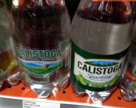
That’s the new look on the left, the old on the right. Now tell me, which is more immediately readable and eye catching on the grocery store shelf?
The new look is nicely updated without losing the brand equity, but they took it too far when they decided to go with transparent labels. It’s another example of the design school of “Hey! Here’s a cool idea!”. I myself subscribe to the school of “Make it simple, stupid.”
I’ll bet this design looked beautiful sitting on a board room table somewhere; but did anyone think to place it on a typical store shelf to see if it was readable?
Another problem with this label design is that one has to stick their face right up to the label to see what flavor it is. The old design had large, easy-to-identify images of fruit on the label (in this case, limes) that could be seen from behind a shopping cart.
Back to the drawing board, please, Calistoga.
