So. Apple’s “Leopard” operating system is set to debut in 10 days. My single prediction about the interface changes doesn’t yet seem to be confirmed: that the system font will change to Helvetica, like the iPhone.
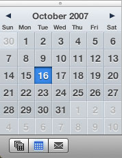
Here’s why I say this: first, they’re using Helvetica everywhere on the iPhone, and Lucida Grande — the current font on the Mac — isn’t even installed on the phone. The interface for Mac OS Leopard has lots in common with the OS X on the phone, from the use of Helvetica to the shiny flat metallic look and embossed text. Address Book cards are in Helvetica. The new iCal mimics the iPhone interface. In the Time Machine system preference pane, it even uses an iPhone-style ON/OFF toggle.
There’s one more compelling clue in Leopard. When expanding a “stack” from the dock into the curved “fan” of files, the title of each file is in Helvetica. Yet, every other piece of text is in Lucida Grande. Why in the world would this one instance be in Helvetica? It stands out like a sore thumb, it looks like a mistake. Helvetica also appears in the Time Machine interface, another new feature.
My reasoning says that it’s the rest of the system that’s a mistake, that this new feature was implemented in Helvetica but all the old, legacy features still use Lucida Grande — for the time being. They’re just waiting for one little switch to be thrown to change them all to Helvetica. In fact, in the Dock you can see that the text seems to have a weird baseline problem — as if the Lucida Grande font is being substituted for something else.
The pictures on Apple’s website still show Lucida Grande (but they also show the Helvetica in the Stack). Will this change happen as a surprise in 10 days? Will they change the errant Helvetica to Lucida Grande? Or will they leave the mismatched fonts in place?
The world waits for the answers to these important questions.

