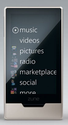
This is the new Zune HD. Even iPod devotees are calling it “sexy.”
Me? The first thing I noticed is that Microsoft couldn’t do something as simple as sizing text to fit the width of the screen.
Speaking of poor usability, we visited Innoventions at Disneyland, a thinly-veiled Microsoft marketing venture disguised as a “house of tomorrow.” Evidently, the house of tomorrow is designed such that you can’t swing a cat without hitting an LCD screen. They’re everywhere — all over the walls, on bookshelves, mantels, tables and the piano. Everywhere one looks there’s a lit up digital photo or status display. It would be impossible to get to sleep in a house that is never dark.
And all over this house was evidence of Microsoft’s lack of user understanding: with all the big screens in the kitchen or on the walls, people were touching them, expecting something to happen. But they aren’t touch screens, they’re just static displays. From the first moment people were confronted with Microsoft’s idea of the house of the future, it was a big, huge fail.
Upstairs at Innoventions, the crowds were swarming around some high tech futuristic game called “X Box 360.” Wow!
It’s telling that people were wandering around with their fingers all over their iPhones. Like the rest of Tomorrowland, Innoventions was a decade or two behind reality.
