

After generations of creating truth from lies, the conservatives have turned to Fox to do the same in a visual medium. Once again, the “news” channel uses deliberately misleading charts to lie to viewers.
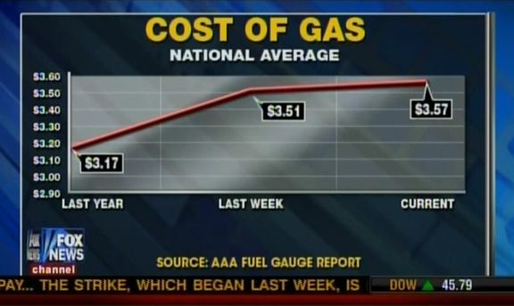
In a segment falsely blaming Obama for rising gasoline prices, Fox News’ America’s Newsroom aired the following chart yesterday. It shows three data points — including the vague “last year” — plotted nonsensically on the x-axis.
“Last year” refers to gas prices last February; Fox’s chart omitted what happened in the 13 months between February 2011 and last week. Here’s how Fox’s source, AAA, displays the data (green line):

As usual, the Republicans are desperate to find some issue which will stick so that they have something to campaign on. This week, they’ve decided that blaming Obama for rising gas prices is a winner. What I find funniest about this line of rhetoric is that they never point the finger at, oh, the oil companies — the ones who are making enormous profits and the ones who decide what the price of the gas will be. What’s even funnier are the sheep who follow the Republicans down that path, who have no ability to string two coherent thoughts together.
It is worth remembering that gas prices went above $4.00 per gallon in the summer of 2008, when George W. Bush was president. The prices stayed at an average of $3.30 that year until the economy collapsed. That’s why gas was so “cheap” when Obama took office. Now that the economy is strengthening, prices are rising. And you can bet that if the GOP was in the White House, they’d be trumpeting what good news that is.
