

Right wingers are making up fake graphs to support their lies about President Obama. Sadly, media literacy is another area that they’ve deliberately marginalized in their education policies, creating a generation of people who can’t tell the truth from lies.
When you think you have seen everything, that is when you find yourself shaking your head in disbelief. Since the general election campaign has kicked off, I have been following politics really closely to see what dirty tricks emerge. Well, I have found one – and in the age of social media, its a big one.
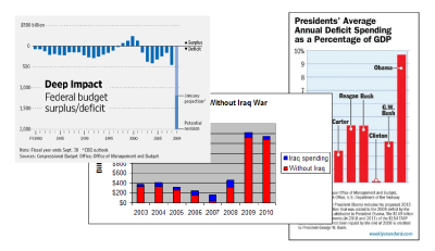
Yesterday I noticed a chart on a right-wing site that had an article that had been posted to Digg. In the post there was a chart. The chart was supposed to show deficit information about the last 6 presidents. I though to myself ‘wow that doesn’t look good for Obama’ but then I noticed something rather odd. The numbers did not match the chart. When I plugged the same numbers into excel, the chart looked completely different. [The Centrist Word]
